Tooltips
You can add a tooltip to any control in CheckFlow. When you add a tooltip an icon is displayed at the top right of the control within your checklist. When a user hovers their cursor over the icon the tooltip text is displayed.
How Tooltips Are Displayed
You can add one tooltip to each control within your checklists. A tooltip is displayed as a blue info icon, which is located at the top right side of the control.
Adding a Tooltip
Open your template and locate the control you want to add a tooltip to.
Click on the Settings button and select the Tooltip option.
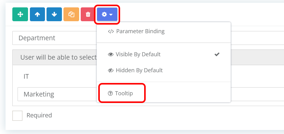
The Control Tooltip popup form will open.
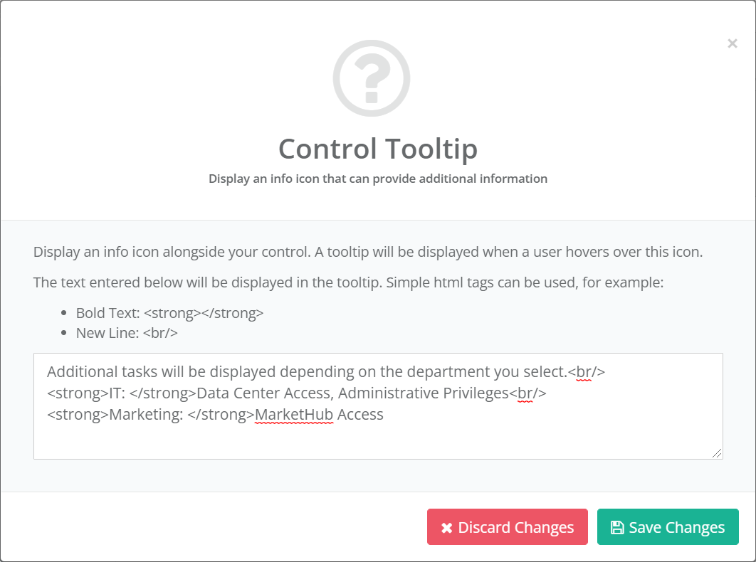
Enter the text you would like to display in your tooltip. You can use HTML tags to format the text.
Once complete, click the Save Changes button. The tooltip text will be saved and the popup form will close.
Removing a Tooltip
To remove a tooltip follow the same steps as above but remove all text from the box and then click the Save Changes button. If no text is detected the tooltip info icon will not be displayed.