Text Control
The Text control is a rich text editor that allows you to present formatted content — text, tables, lists, links and images — to the person running the checklist.
It is by far the most commonly used content control, and is normally used to give instructions, background information, warnings or reference material relevant to the task.
The content is written once in the template and displayed, unchanged, in every checklist created from that template. The user cannot edit it.
Add to the Template
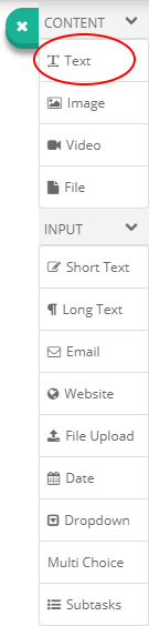
The Text control can be added from the controls toolbar in the Template.
Drag and drop the control button from the toolbar on to the task content area. This allows you to place it exactly where you want it.
You can also click the button in the toolbar to add the control to the task content area below any existing controls.
The Text Editor
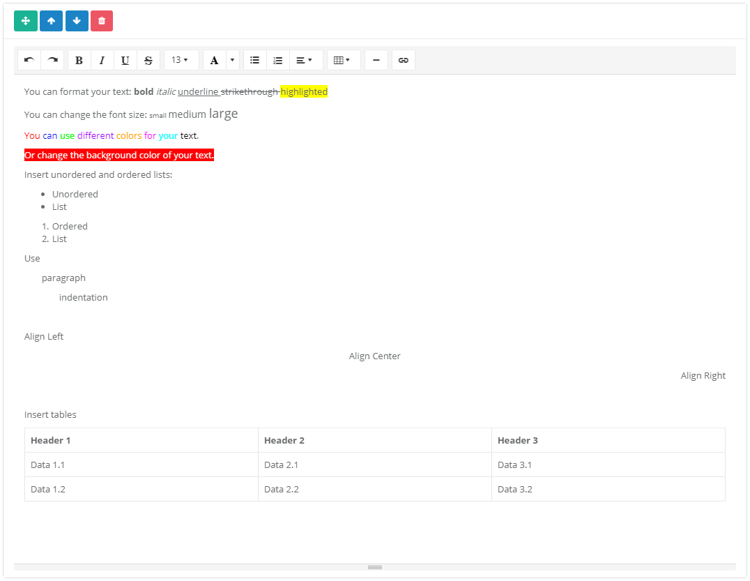
Once you have added the control you will see that a rich text editor is displayed. You can enter the content you would like to be displayed in here. It will be displayed in the checklist exactly as it appears in the editor.
You can use the editor toolbar to perform different formatting actions. You will probably be familiar with these actions from using other word processing software such as Microsoft Word or Apple Pages — this works in much the same way.
The formatting actions available are:
- Alignment
- Font size, style and colour
- Bold, italic, underline and strikethrough
- Bulleted and numbered lists
- Indentation
- Tables
- Links
- Images
- Horizontal rules
Images
Images can be inserted directly into the editor, either by using the image button on the toolbar or by dragging a file into the editor area. The file is uploaded to CheckFlow's cloud storage and a progress bar is shown while the upload completes. Wait for the upload to finish before saving the template.
For a large, standalone image with a caption, the dedicated Image control is usually the better choice.
Dynamic Values
The Text control accepts Dynamic Values, so the text shown to the user can include data captured elsewhere in the same checklist — a customer name, a selected site, a date entered earlier in the process.
Insert one by typing {{ anywhere in the editor, or by clicking the button on the editor toolbar. A popup lists every dynamic value available in the template; type to filter it and choose the one you want. The placeholder is inserted as blue text wrapped in curly braces, and can be deleted with the Backspace or Delete key.
Placeholders are resolved when the checklist runs:
- Global dynamic values (checklist name, current user and similar) are substituted when the checklist loads.
- Content control dynamic values are substituted as soon as the control they refer to is given a value, and update again whenever it changes.
A reminder of both insertion methods is displayed underneath the editor in the template.
Tooltip
Like every other control, a Text control can be given a Tooltip from its settings cog. The tooltip icon appears in the top right corner of the control.
Use in the Checklist
The formatted content is displayed in the task, exactly as authored.
The control is read-only. There is nothing for the user to fill in, no validation is performed against it, and it never blocks task completion.
Limits
| Limit | Value |
|---|---|
| Formatting | Alignment, font size, style and colour, bold, italic, underline, strikethrough, lists, indentation, tables, links, images and horizontal rules |
| Maximum content length | No limit |
| Maximum image size | No limit imposed by CheckFlow |
Notes and Limitations
- Because the content is part of the template, changing it does not change checklists that have already been created — only new ones.
- The Text control holds no user input, so it does not appear in Reports, and it cannot be the source of a Conditional Logic rule or of a Dynamic Value. It can still be shown or hidden by a condition driven by another control, which is a common way to display a warning or an extra instruction only when it is relevant.
- A Text control can be the child control in a Linked Checklist mapping. When the child checklist is created, the value from the mapped parent control replaces the Text control's content entirely — so use this only where the whole block of text is meant to come from the parent. A Text control cannot be the parent side of a mapping.
Related Pages
- Image — for a large standalone picture with a caption, rather than one inline in the editor.
- Mail-To — the other control that accepts inline dynamic value placeholders.
- Dynamic Values — the full list of placeholders you can insert, and when each resolves.
- Tooltips — for guidance most users will not need, which would clutter the task if written out.